Minimal wedding invitations have become a popular trend over the last decade or two, predominantly for couples seeking a more modern take on their wedding styling and stationery. They are largely characterized by concise and simple wording often typeset in small font sizes, large expanses of white (or negative) space, little to no decorative elements, patterns, or illustrations, and monochromatic, neutral, pale, or muted color palettes. Yum. What’s not to love.

The Curator - a modern wedding stationery collection, by The Letterist
The simplicity and sparing aesthetic of modern, minimalist wedding stationery represents an intentional departure from more traditional and ‘old-fashioned’ designs. These often included ornate calligraphy or script typography, elaborate floral or decorative illustrations, and frequently, color palettes considered “feminine” or “delicate” including shades such as blush, pink, lavender, and purple, or more broadly the colorful tones one may find in a spring or summer bouquet.
The choice to depart from tradition in design and a visual sense, may also represent a more symbolic choice to depart from the conventional traditions of weddings and marriage more broadly. A stripping down of centuries-old beliefs and norms that the couple may no longer feel are relevant to them, or in line with their core values.
Simplicity of design as shown on The Curator collection
Characteristics of minimal wedding invitations
When designing a minimal wedding invitation or suite, such as our beloved collection The Curator, we often follow these four principles:
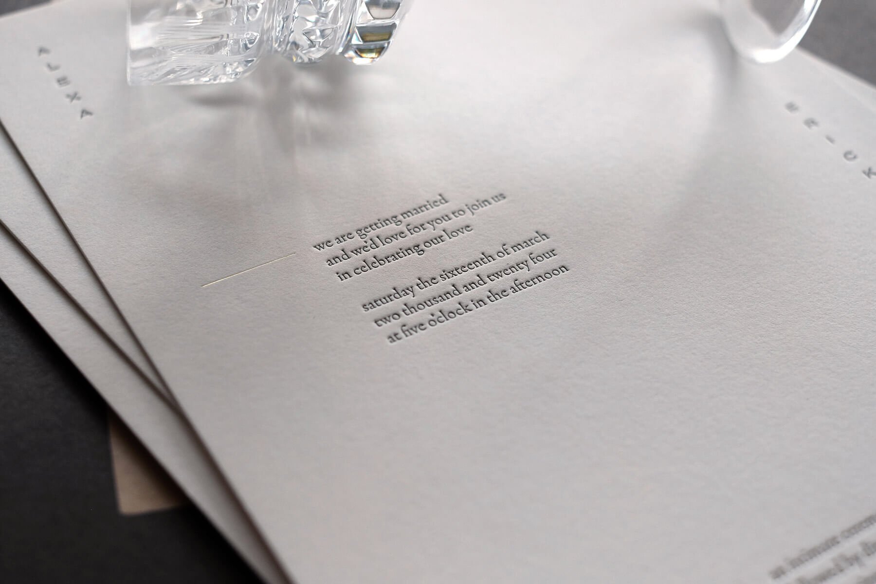
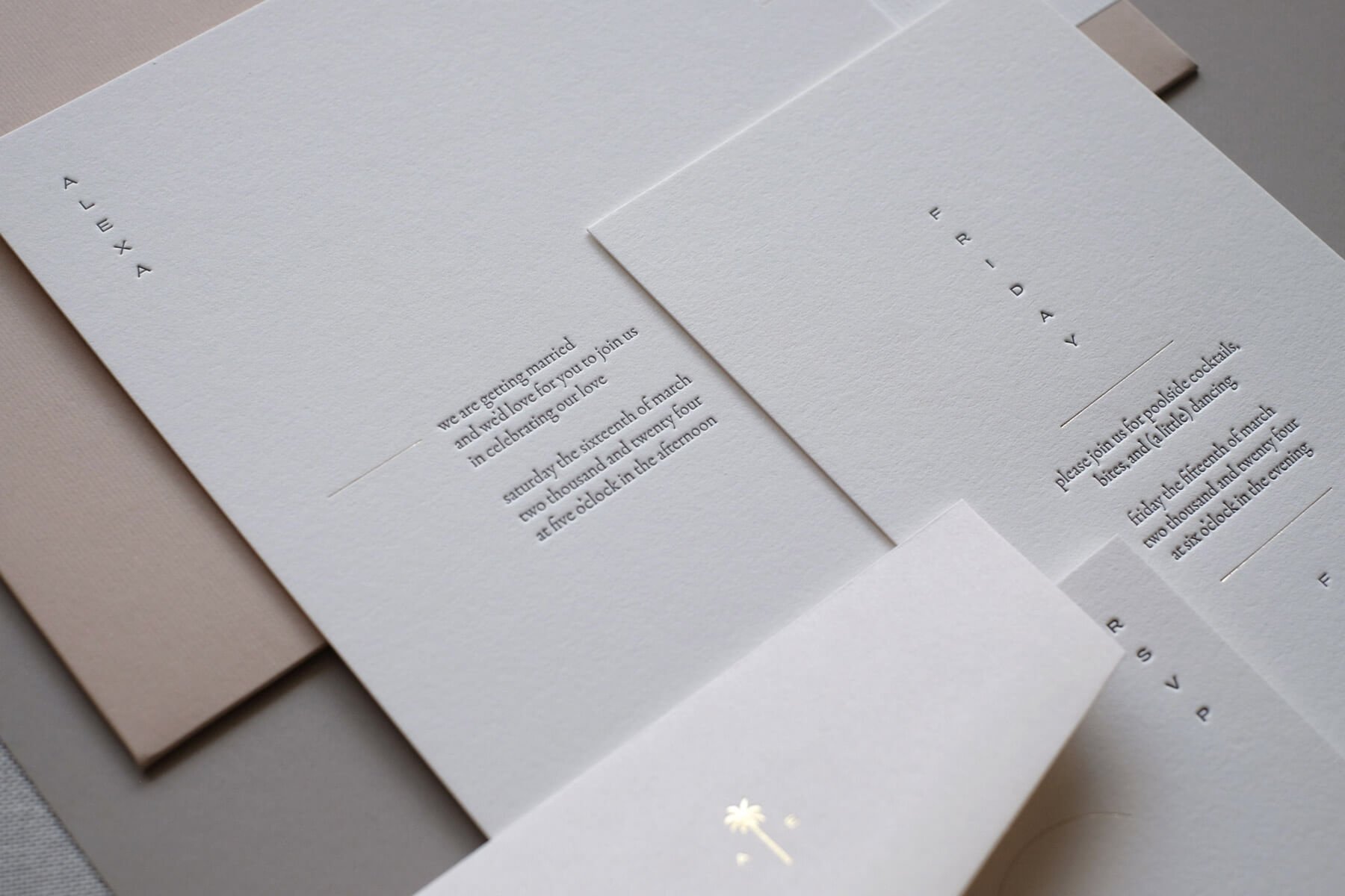
Concise and simple wording
Intentionally typeset in short lines, and ideally in structured blocks or paragraphs of the same length to create a sense of ease and lightness both in appearance and in the experience of reading and understanding or digesting the content. We’ll often explore variations and propose modifications to your invitation wording that would best fulfill both of these aims.
Small font sizes and typefaces
Without too much adornment, pomp or circumstance. Don’t get us wrong. We love an elaborate typeface with glyphs and swashes and alternates and unique serifs…but it does not belong in the minimalist repertoire. The typeface can be serif or sans-serif, but it often has an even line weight and classical proportions without too much contrast or stylistic embellishment.

LOWERCASE AND LETTERSPACING
We’ll often, to simplify the visual appearance of the type even further, typeset all or most of the text entirely in lowercase. This creates more even and clean line-heights without the tall uppercase characters standing out and unnecessarily attracting attention to particular words. PSA! Saturday can also be saturday - no one will get confused.
And lastly, with typesetting - minimal layouts will often have purposefully wide letter-spacing, and the word saturday might in fact look more like: s a t u r d a y.
PALE, NEUTRAL & MUTED ColorS
Again, the less is more tenet applies here. Minimal wedding invitation suites are often printed on papers that are pale, neutral, muted, or monochromatic.

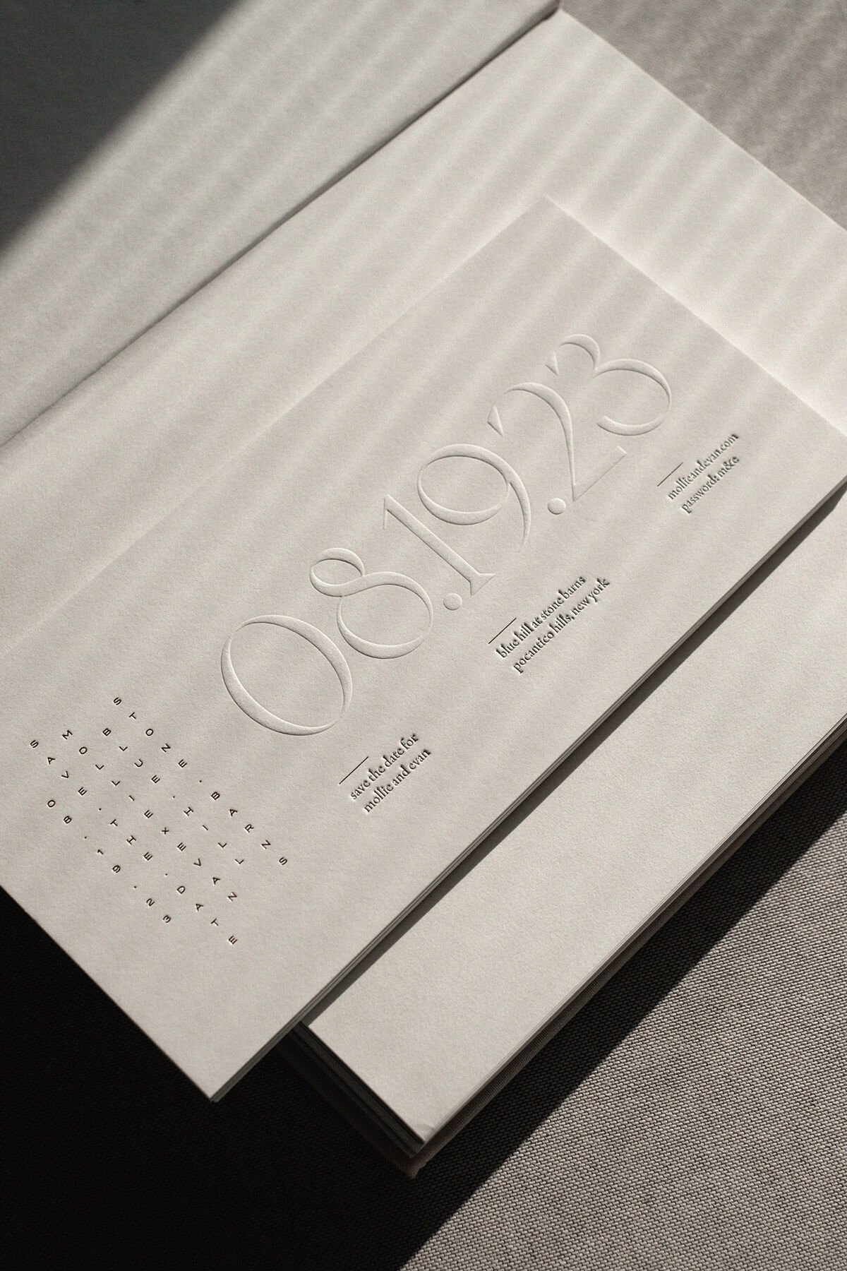
Minimalism loves space
Space is breathing room. Space, in fact, is the primary “decorative” element in minimalist design. You’ve probably heard the expression, less is more.
As you’ll see in our invitations, save the dates, and day-of stationery from The Curator collection, each layout often has more negative space than printed or “covered” areas. The shape taken by the negative space serves to create direction and movement within each piece that will draw the reader’s eye to what is important.
Because we are all about Love on Paper, and source the finest quality papers from exceptional manufacturers around the world, it is also important to us that the paper itself can be seen. That the paper is not merely the medium, but a key part of the artwork itself.
We could say a lot more about space and how it functions in design…but perhaps we’ll pause here and point out a more symbolic intention behind all the white space on our wedding invitations - which is our unwavering belief that love, and couples, need space to survive and to grow.
Why choose wedding invitations with a minimal aesthetic?
A save the date or invitation is often the first piece of communication that goes out to your guests. In a way, it serves - especially in the case of a Save the Date - as a “teaser” or hint of what’s to come. Even if your wedding ceremony or reception itself may take place in an elaborately designed venue, or be adorned with beautiful floral and botanical installations, or be set against a backdrop of vivid and magnificent scenery…you don’t necessarily need to give that all away at once.
Here is an invitation suite from The Curator we did for a vibrant destination wedding in Mexico. You can trust that Mexico itself will bring all the color. You don’t need to paint your invitations in the colors of the flag or like a tray of guac, chips, and salsa. (Of course you can if you like! No judgment here. We’re just saying you don’t have to). Leaving room for moments of surprise as you lead up to your big day can also be impactful.
Minimal wedding invitations are also more gender-neutral or non-binary than more traditional designs that lean towards stereotypically feminine elements. This might make them a popular choice for same-sex or non-binary couples who don’t necessarily want stationery that is traditionally feminine or masculine. And as we said above, minimalism is in general quite tradition-neutral…so anyone looking to party like it’s 2025 and not 1955 will probably find a home here.
Lastly, there is something about minimalism that comes across as quiet, grown-up, humble confidence. A minimal wedding invitation says, “we’ve found each other, we love each other, we love you, and we’d love for you to be there.” That is all. There is nothing more to it. No need to one-up what your best friend or big sister did, no need to prove anything, no need to impress anyone…
…but don’t worry, it totally will impress. Just in a less obvious, and more meaningful way.
MINIMAL WEDDING INVITATION Wording
We work closely with all our clients to carefully craft wording that sets the right tone for their celebration and works well within a minimal design layout. It needs to sound good, it needs to read easily and be clear, and it absolutely has to look good. So sometimes there are a few compromises to be made…but here are a few tips.
Basically, throw everything you read about traditional wedding wording online out the window. You don’t have to say, The Honor of Your Presence is Requested, you don’t have to capitalize those or any other words, you don’t have to spell the date out in full, and you certainly don’t have to spell the time out in full.
Of course you will want to check with your parents, if they’re paying (!), if they’re inviting their friends, or if they’d like to still retain some threads of tradition in there. But, (be very nice to them!) and try and find a balance or compromise. If you use traditional wording, perhaps try it all in lowercase to modernize it a bit. If you want to spell out the date - perhaps just say “six o’clock” instead of “six o’clock in the evening.” Don’t worry, no one’s going to think you’re tying the knot at dawn. (Ok, if you are, then you may actually need to spell it out).
If you are having a whole weekend fiesta or destination wedding that requires you to share a lot of nitty gritty details on travel, accommodation, shuttles, and attire - consider breaking some of it up onto separate inserts (budget allowing), or putting it all on a wedding website. A folded piece is also, always a great solution. This allows you to have a minimal front cover with nitty gritty on the inside, or in the case of a letter format - simply provides you more room to spread things out and still have negative space.
Lastly, the thesaurus is your friend. Always explore if there is a shorter, tidier, more casual, more fun, or more you, way to title or word something. Lodging is shorter than accommodation but still a little frumpy, Hotels is nice and to the point, and “Where to stay” is somewhere in between lengthwise, but has a nice warm, informal feel.

Destination weekend wedding itinerary from The Curator collection.
In closing, we’ll say one more thing…if this long post didn’t already make that clear. Minimalism is a lot of work. It takes time, energy, and often a lot of explorations and revisions to get it right. Juggling tradition, parents, gender, addresses, times, shuttles and space! - and trying to get all that to land in its rightful little spot isn’t easy. But we’ll do most of the work for you. And we promise, for better or for worse, in sickness and in health, IT IS ALWAYS WORTH IT.
Find out more
You can see more of The Curator, our modern wedding stationery collection, here. If you’d like to use it for your own wedding, please get in touch.